
ACCOUNTS RECEIVABLES
-
-
-
-
Company
Paystand is revolutionizing B2B payments with a modern infrastructure built as a SaaS on the blockchain, enabling faster, cheaper, and more secure business transactions.
Our mission is to reboot commercial finance by creating an open financial system.
Payments as a ServiceWhere We Operate
United states
 Paystand is headquartered in California and operates nationwide, serving businesses across all 50 states.
canada
 We support operations in Canada with localized payment capabilities, including CAD EFT and cross-border support.


For the past century, business payments have struggled to keep up with digitization. Every other part of the enterprise has gone digital, yet commercial finance has been left behind in an analog world plagued by costly fees, inefficient systems, and paper-driven processes. It’s time for a more seamless, simple, and intuitive way to manage transactions.
We created Paystand to eliminate fees, digitize the cash cycle, and create a self-driving money experience for businesses.
.webp?quality=85&width=3850&height=3404&name=ABOUT%20HEADER%20(1).webp)
Our Story: We believe in a better financial system
In 2013, Paystand dove headfirst into the uncharted waters of reinventing commercial finance.
Inspired by pioneers taking sales and marketing into the cloud to become faster and more efficient, it was easy to imagine a better financial system where making a transaction was as simple, fast, and intuitive as calling an Uber or Lyft. One where artificial intelligence could analyze an entire business and recommend customized improvements for each customer, based on their payments history.
.png?width=1530&height=1487&name=piggy-bank%20(1).png "piggy-bank (1)")
Unfortunately, most payments solutions drain time and revenue. They charge outrageous fees, are hampered down by hidden costs and gatekeepers, and distract you from the important tasks that scale revenue.
So we’re building a solution that changes that. The Paystand network anchors on four key benefits that drive ROI for your business:
1. Faster time-to-cash so you never have to chase down payments.
2. Automate tedious, repetitive tasks to increase speed and efficiency.
3. Eliminate transaction fees to enable up to 50% cost savings.
4. Seamless and intuitive interactions for better customer experiences.

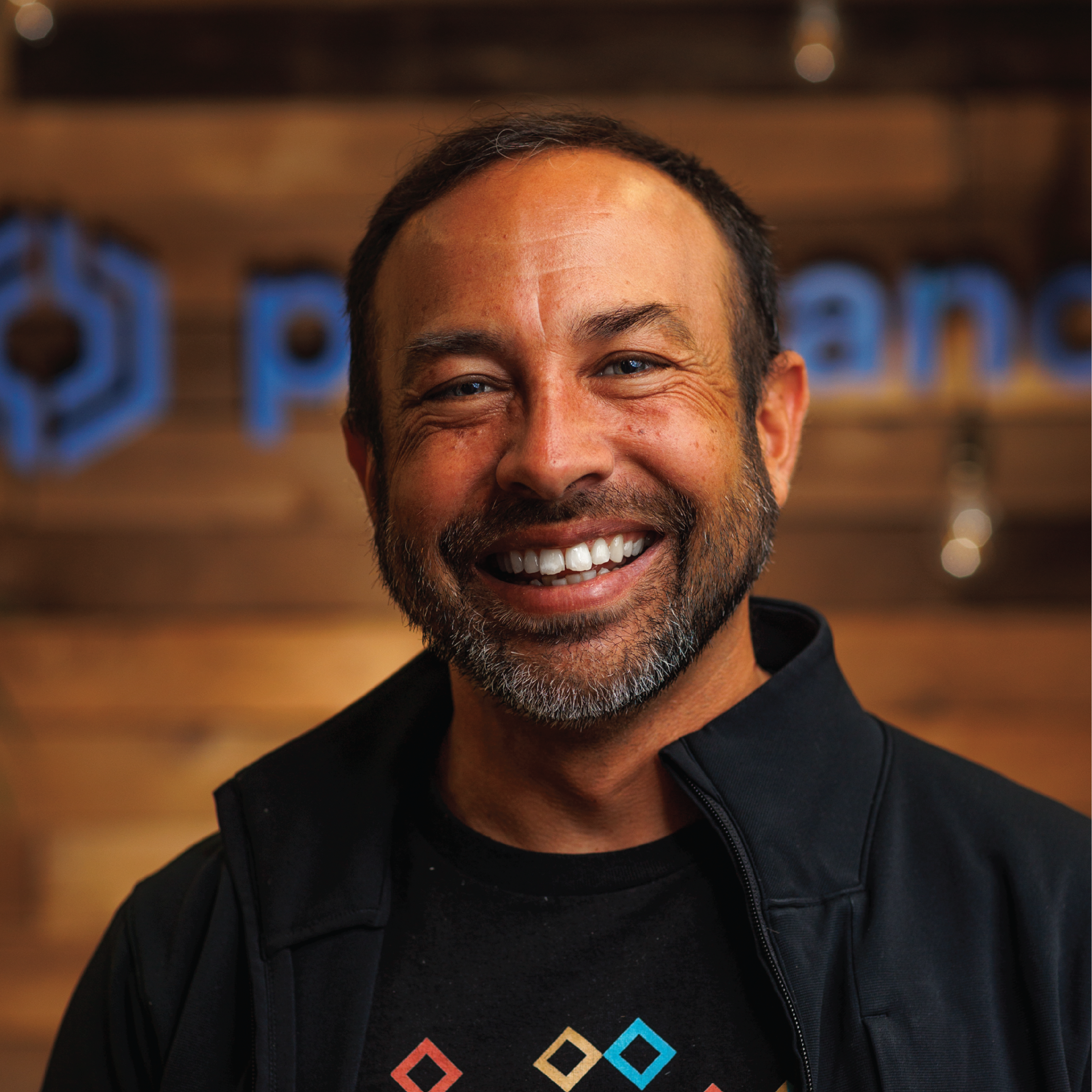
Jeremy Almond
Co-Founder and CEO
Jeremy is a technology visionary and industry veteran with decades of experience leading growth and engineering teams at Digital Instruments and Veeco. He has spent the last 15 years as a serial entrepreneur, startup advisor, and occasional investor.

Mark Hassin
COO
Mark is an accomplished entrepreneur and business leader with over 15 years of experience in the financial technology industry. He's been pivotal in driving significant growth at fintech companies such as Tipalti, EquityBee, and BlueSnap. Mark has been instrumental in driving Paystand's growth as the company’s first CRO.

Scott Bennion
CFO
Scott is a fintech and SaaS veteran with a distinguished career helping hyper-growth companies achieve scale, having led both Sage Intacct and Recurly through significant growth and acquisition. Scott brings a deep knowledge of fintech and ERPs, along with a track record of leading disruptive finance organizations.

Alexandra Navarro
Chief of Impact
Alexandra is key in orchestrating strategic projects and upholding our core values at Paystand. Drawing on 20+ years of experience from nonprofits to corporates, Alexandra, with her experience at nonprofit Latinas in Tech and Digital Nest, infuses our vision with her invaluable expertise.

Sergio Almaguer
Chief Product Officer
As the founder and former CEO of Yaydoo, Sergio brings a robust entrepreneurial background to Paystand. With 15+ years in tech across LATAM, US, and Europe, he's led teams at startups, Microsoft, and GE Energy.

Allison Grieb
Chief Sales Officer
With over 24 years in sales, Allison brings a wealth of experience from her roles as SVP of Global Sales at Recurly and VP of Global Alliances at Anaplan. With a proven track record at companies such as Microstrategy and Actuate, Allison excels in sales, go-to-market strategy, and customer success.

Mike Parks
SVP of Operations
Mike is the SVP of Operations and assesses the risk and health of the Paystand Network and its customers. Before Paystand, he served as CIO of Virgin Mobile, building next generation telco operations, and as EVP for Wells Fargo's Credit and Bank Integration team.

Scott Campbell
Co-Founder and Head of Solutions
Scott heads the Solutions and Services organization at Paystand. He has over 25 years of technology experience. Previously, he served as a product leader and engineer at Google, refining their Local Search product and at Morgan Stanley, helping to simplify financial products.

Meridith Perry
Teampay General Manager
Meridith Perry is the General Manager at Teampay. She drives strategic growth initiatives and oversees business operations to enhance the company's leadership in spend management solutions. With deep expertise in partnerships, revenue growth, and business development, Meridith plays a key role in expanding Teampay’s market presence.

Sam Smith
VP of Customer Experience
Sam leads the Customer Success organization and is a veteran of both the Marketing and Creative industries, having led large-scale Success teams in Silicon Valley. He was previously the VP of Customer Success at Distribute, BrightTalk, and Verifone.
.png)
Chris Jacobson
VP of Product
Chris Jacobson is the Vice President of Product at Paystand, where he leads product strategy and innovation to drive the company's mission of revolutionizing B2B payments. Chris plays a crucial role in shaping Paystand’s product roadmap, enhancing platform capabilities, and delivering cutting-edge payment solutions.
Co-Founder and CEO
Jeremy Almond
Jeremy is a technology visionary and industry veteran with decades of experience leading growth and engineering teams at Digital Instruments and Veeco. He has spent the last 15 years as a serial entrepreneur, startup advisor, and occasional investor.
COO
Mark Hassin
Mark is an accomplished entrepreneur and business leader with over 15 years of experience in the financial technology industry. He's been pivotal in driving significant growth at fintech companies such as Tipalti, EquityBee, and BlueSnap. Mark has been instrumental in driving Paystand's growth as the company’s first CRO.
CFO
Scott Bennion
Scott is a fintech and SaaS veteran with a distinguished career helping hyper-growth companies achieve scale, having led both Sage Intacct and Recurly through significant growth and acquisition. Scott brings a deep knowledge of fintech and ERPs, along with a track record of leading disruptive finance organizations.
Chief of Impact
Alexandra Navarro
Alexandra is key in orchestrating strategic projects and upholding our core values at Paystand. Drawing on 20+ years of experience from nonprofits to corporates, Alexandra, with her experience at nonprofit Latinas in Tech and Digital Nest, infuses our vision with her invaluable expertise.
Chief Product Officer
Sergio Almaguer
As the founder and former CEO of Yaydoo, Sergio brings a robust entrepreneurial background to Paystand. With 15+ years in tech across LATAM, US, and Europe, he's led teams at startups, Microsoft, and GE Energy.
Chief Sales Officer
Allison Grieb
With over 24 years in sales, Allison brings a wealth of experience from her roles as SVP of Global Sales at Recurly and VP of Global Alliances at Anaplan. With a proven track record at companies such as Microstrategy and Actuate, Allison excels in sales, go-to-market strategy, and customer success.
SVP of Operations
Mike Parks
Mike is the SVP of Operations and assesses the risk and health of the Paystand Network and its customers. Before Paystand, he served as CIO of Virgin Mobile, building next generation telco operations, and as EVP for Wells Fargo's Credit and Bank Integration team.
Co-Founder and Head of Solutions
Scott Campbell
Scott heads the Solutions and Services organization at Paystand. He has over 25 years of technology experience. Previously, he served as a product leader and engineer at Google, refining their Local Search product and at Morgan Stanley, helping to simplify financial products.
Teampay General Manager
Meridith Perry
Meridith Perry is the General Manager at Teampay. She drives strategic growth initiatives and oversees business operations to enhance the company's leadership in spend management solutions. With deep expertise in partnerships, revenue growth, and business development, Meridith plays a key role in expanding Teampay’s market presence.
VP of Customer Experience
Sam Smith
Sam leads the Customer Success organization and is a veteran of both the Marketing and Creative industries, having led large-scale Success teams in Silicon Valley. He was previously the VP of Customer Success at Distribute, BrightTalk, and Verifone.
VP of Product
Chris Jacobson
Chris Jacobson is the Vice President of Product at Paystand, where he leads product strategy and innovation to drive the company's mission of revolutionizing B2B payments. Chris plays a crucial role in shaping Paystand’s product roadmap, enhancing platform capabilities, and delivering cutting-edge payment solutions.

Jonathan Ebinger
Board Member
General Partner, Blue Run Ventures
Jonathan Ebinger is a General Partner at BlueRun Ventures where he focuses on mobile, enterprise software and FinTech. Jonathan was the first institutional investor in PayPal and has invested in numerous fintech unicorns including Coupa and Kabbage. Prior to BlueRun, Jonathan was a marketing executive at Qwest Communications, Bell Atlantic and MCI Communications. He has also started e-commerce businesses as an entrepreneur.
LinkedIn
Neeraj Gupta
Board Member
Co-Founder and Managing Partner, Cervin Ventures
Neeraj Gupta is a Co-Founder and Managing Partner at Cervin Ventures, where he has led investments in Nexient, SnapLogic, and Punchh. Most recently, Neeraj was a member of the executive team at Patni, after its acquisition of Cymbal Corporation that he founded. Previously, he held numerous engineering and product management positions at Octel and Genesys. He is a Kauffman fellow.
LinkedIn
Roman Leal
Board Member
Managing Partner, Leap Global Partners
Roman Leal is a Managing Partner at Leap Global Partners, focused on cross-border opportunities. He is a serial entrepreneur and FinTech veteran, having served in a a variety of roles at PayPal and Goldman Sachs. At PayPal, he co-led next-gen financial services, digital currencies and P2P strategies. At Goldman, he was a founding member of the Emerging Technology Research and Payment Processing Around the World platforms
LinkedIn
Pete Kight
Advisor
Pete Kight is considered a pioneer in financial services technology, specifically in electronic
funds transfer, online banking, and electronic billing and payment. Today he is focused on driving industry innovation, leading strategic development, and working with companies in the FinTech space. Kight was the Founder, Chairman, and Chief Executive Officer of CheckFree until it was acquired by Fiserv in December 2007 ($4.4 Billion).

Scott Thompson
Advisor
Scott Thompson is currently the CEO of Tuition.io. He is the former President of PayPal and CEO of Yahoo, and is a renowned technologist best known for growing PayPal’s user base from 50 million to 104 million active users in 190 countries. Thompson also served as an executive vice president of technology solutions at Visa's Inovant subsidiary and worked as chief information officer of Barclays Global Investors.
LinkedIn
Mark Orttung
Advisor
Mark Orttung is the CEO of Nexient and former President and COO of Bill.com, a SaaS offering allowing companies to automate their payables and receivables. Under Mark’s leadership, the company grew revenue by almost 350% in his last two years. Mark was named one of the Top 50 Tech Services CEO’s in 2019. Mark is also an inventor or co-inventor on more than 30 US patents.
LinkedIn
Sameer Govil
Advisor
Sameer Govil is currently a Senior Advisor, Mckinsey and serves on Board of Revolut, US in addition to advisory roles with several Fintechs and Venture funds. As SVP at Visa, he helped establish a roadmap for integrated commerce products, accelerating adoption of electronic payments globally. He also served on the Board of the Electronic Transaction Association, a governing body for US payment acquirers.
LinkedIn
Salil Pitroda
Advisor
Salil Pitroda is senior advisor at Francisco Partners. Salil was a founder, product and business executive and board member at C-SAM, a pioneering mobile payments software company that was successfully acquired by Mastercard (Masterpass). He was also a leader on the corporate and business development team at Facebook, where he worked across product roadmap priorities.
LinkedIn
Board Member
Jonathan Ebinger
General Partner, Blue Run Ventures
Jonathan Ebinger is a General Partner at BlueRun Ventures where he focuses on mobile, enterprise software and FinTech. Jonathan was the first institutional investor in PayPal and has invested in numerous fintech unicorns including Coupa and Kabbage. Prior to BlueRun, Jonathan was a marketing executive at Qwest Communications, Bell Atlantic and MCI Communications. He has also started e-commerce businesses as an entrepreneur.
LinkedIn
Board Member
Neeraj Gupta
Co-Founder and Managing Partner, Cervin Ventures
Neeraj Gupta is a Co-Founder and Managing Partner at Cervin Ventures, where he has led investments in Nexient, SnapLogic, and Punchh. Most recently, Neeraj was a member of the executive team at Patni, after its acquisition of Cymbal Corporation that he founded. Previously, he held numerous engineering and product management positions at Octel and Genesys. He is a Kauffman fellow.
LinkedIn
Board Member
Roman Leal
Managing Partner, Leap Global Partners
Roman Leal is a Managing Partner at Leap Global Partners, focused on cross-border opportunities. He is a serial entrepreneur and FinTech veteran, having served in a a variety of roles at PayPal and Goldman Sachs. At PayPal, he co-led next-gen financial services, digital currencies and P2P strategies. At Goldman, he was a founding member of the Emerging Technology Research and Payment Processing Around the World platforms
LinkedIn
Advisor
Pete Kight
Pete Kight is considered a pioneer in financial services technology, specifically in electronic
funds transfer, online banking, and electronic billing and payment. Today he is focused on driving industry innovation, leading strategic development, and working with companies in the FinTech space. Kight was the Founder, Chairman, and Chief Executive Officer of CheckFree until it was acquired by Fiserv in December 2007 ($4.4 Billion).
Advisor
Scott Thompson
Scott Thompson is currently the CEO of Tuition.io. He is the former President of PayPal and CEO of Yahoo, and is a renowned technologist best known for growing PayPal’s user base from 50 million to 104 million active users in 190 countries. Thompson also served as an executive vice president of technology solutions at Visa's Inovant subsidiary and worked as chief information officer of Barclays Global Investors.
LinkedIn
Advisor
Mark Orttung
Mark Orttung is the CEO of Nexient and former President and COO of Bill.com, a SaaS offering allowing companies to automate their payables and receivables. Under Mark’s leadership, the company grew revenue by almost 350% in his last two years. Mark was named one of the Top 50 Tech Services CEO’s in 2019. Mark is also an inventor or co-inventor on more than 30 US patents.
LinkedIn
Advisor
Sameer Govil
Sameer Govil is currently a Senior Advisor, Mckinsey and serves on Board of Revolut, US in addition to advisory roles with several Fintechs and Venture funds. As SVP at Visa, he helped establish a roadmap for integrated commerce products, accelerating adoption of electronic payments globally. He also served on the Board of the Electronic Transaction Association, a governing body for US payment acquirers.
LinkedIn
Advisor
Salil Pitroda
Salil Pitroda is senior advisor at Francisco Partners. Salil was a founder, product and business executive and board member at C-SAM, a pioneering mobile payments software company that was successfully acquired by Mastercard (Masterpass). He was also a leader on the corporate and business development team at Facebook, where he worked across product roadmap priorities.
LinkedIn


